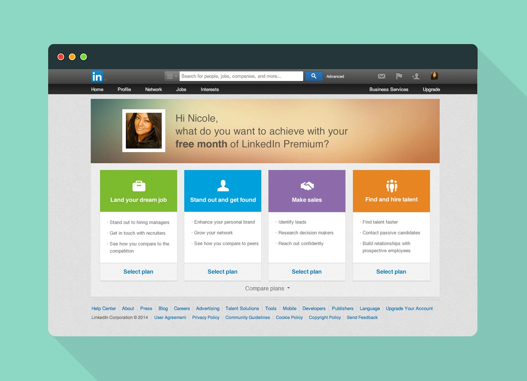
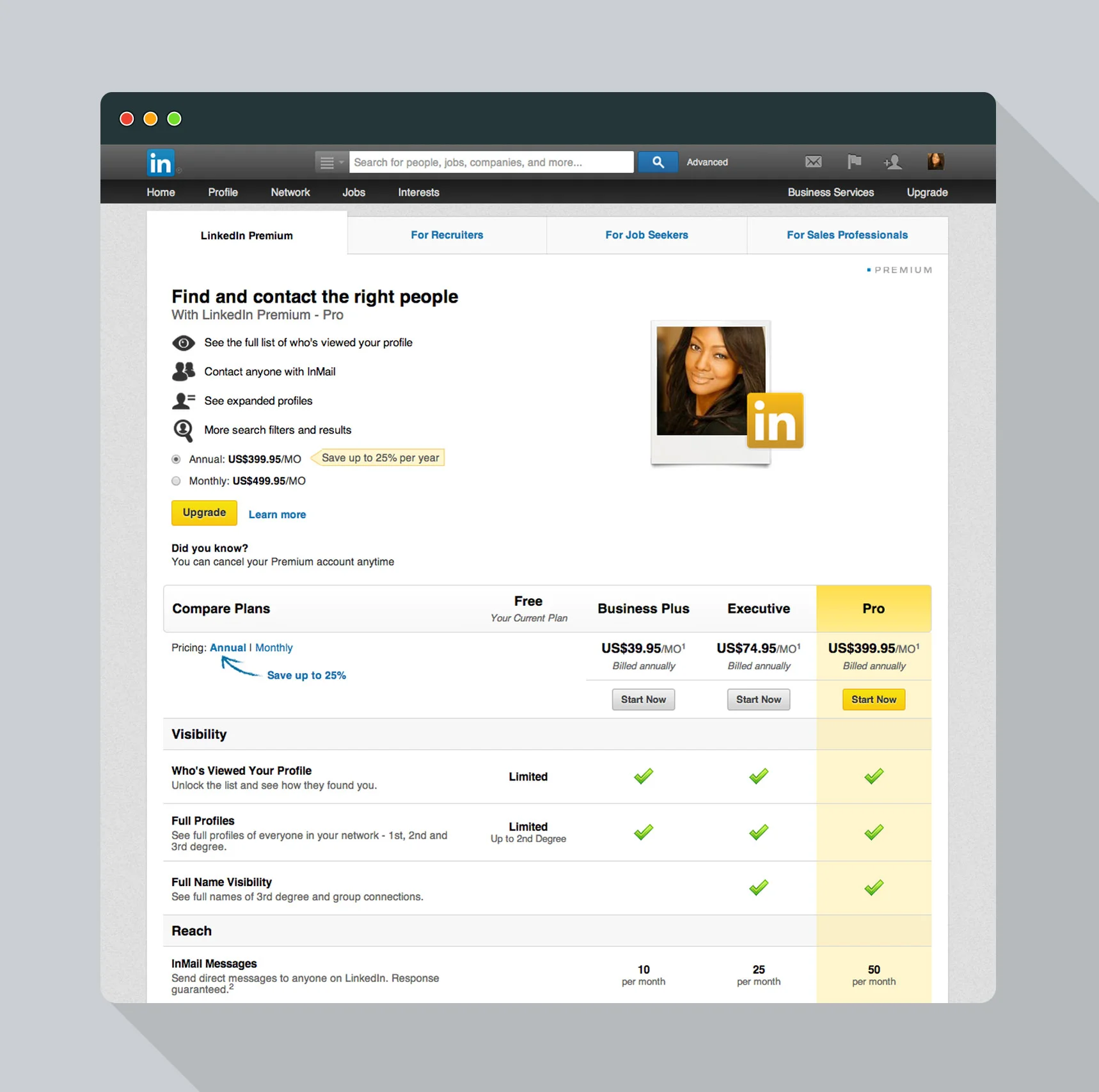
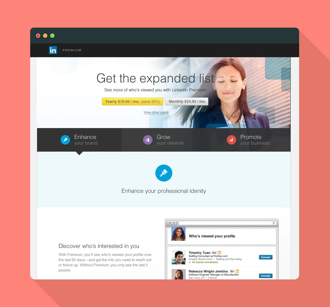
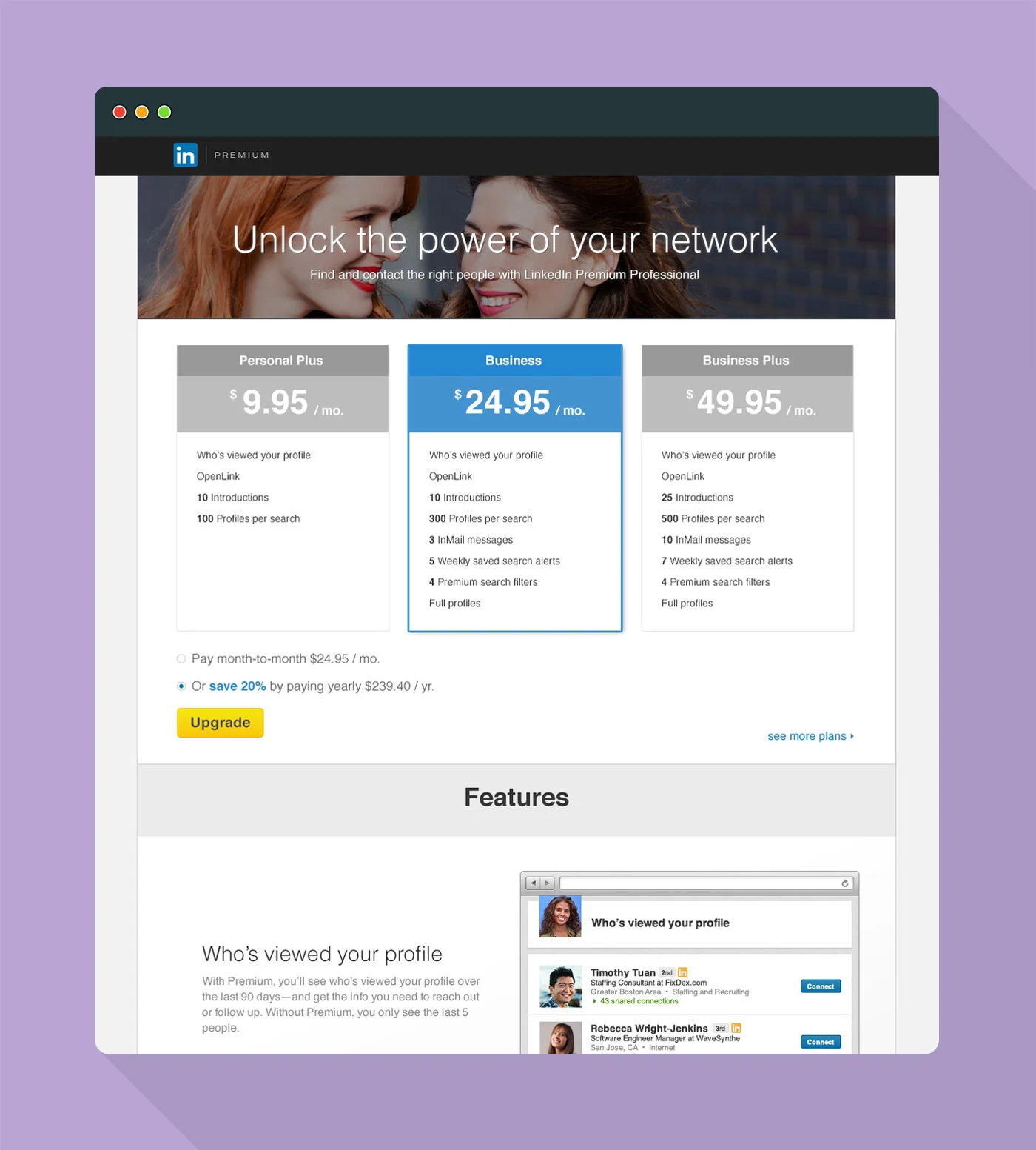
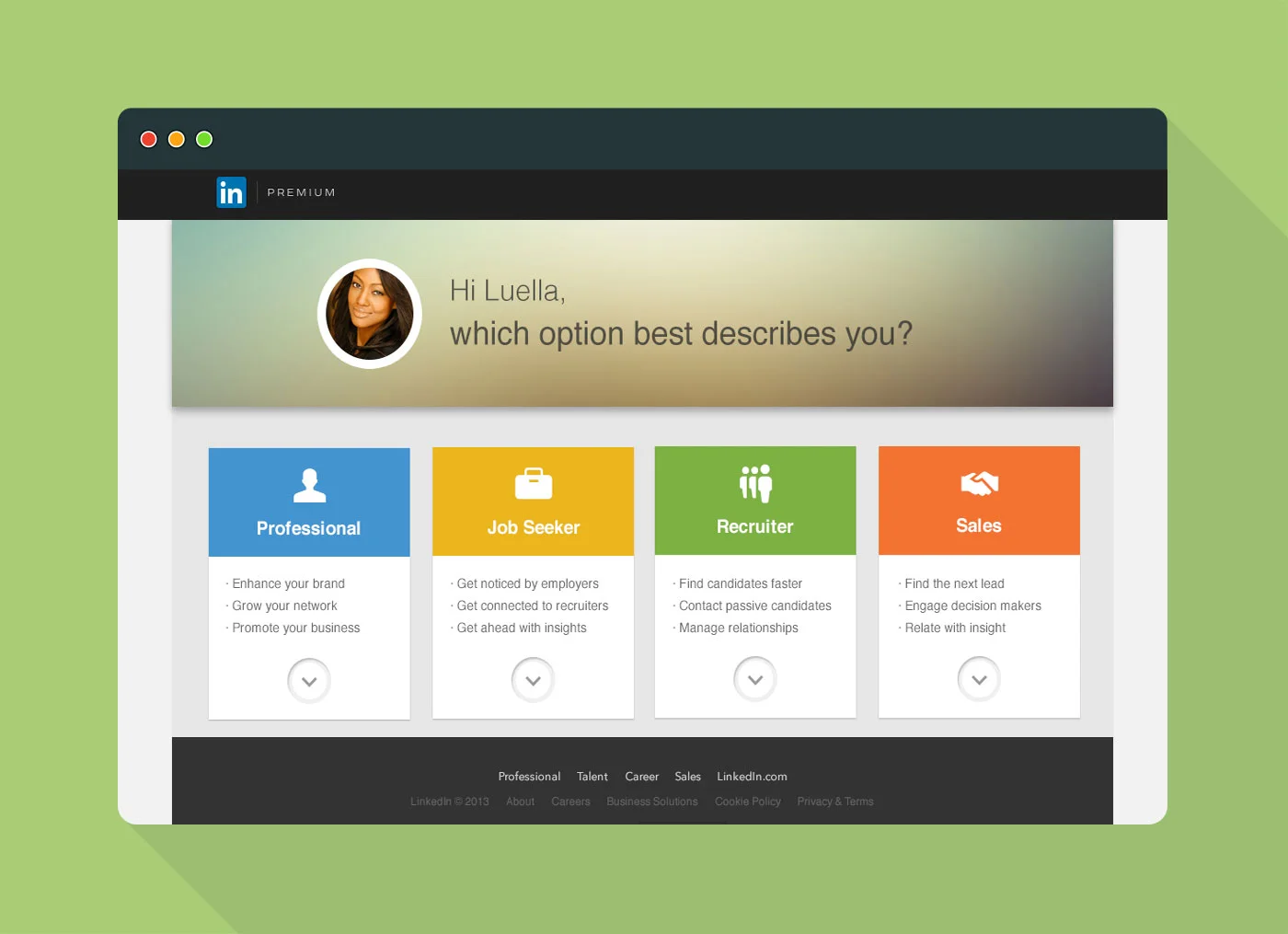
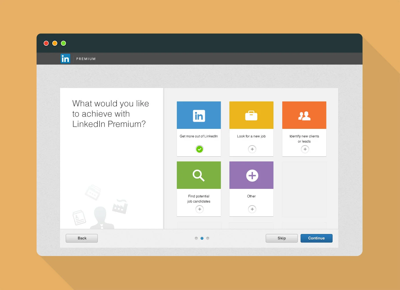
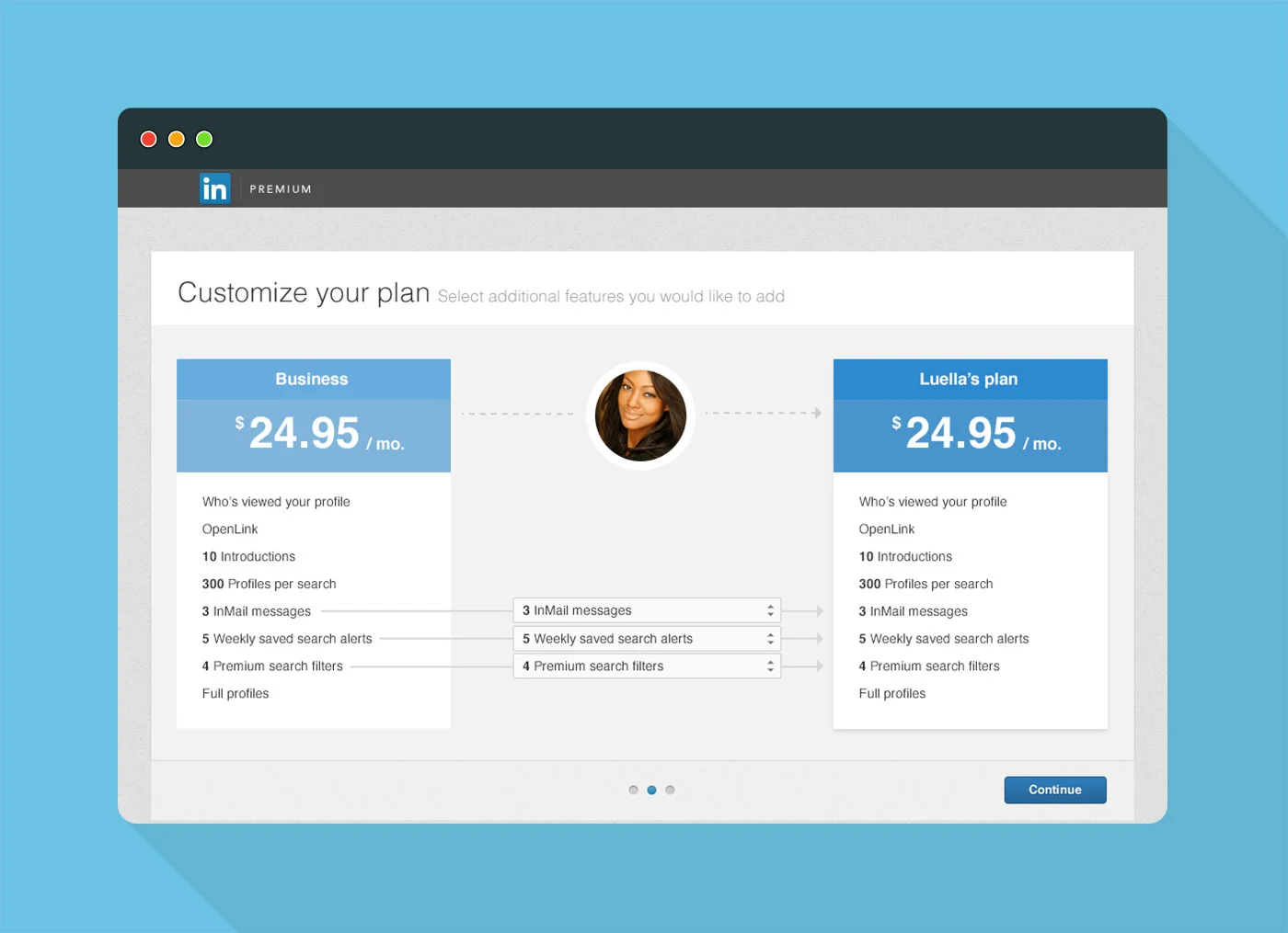
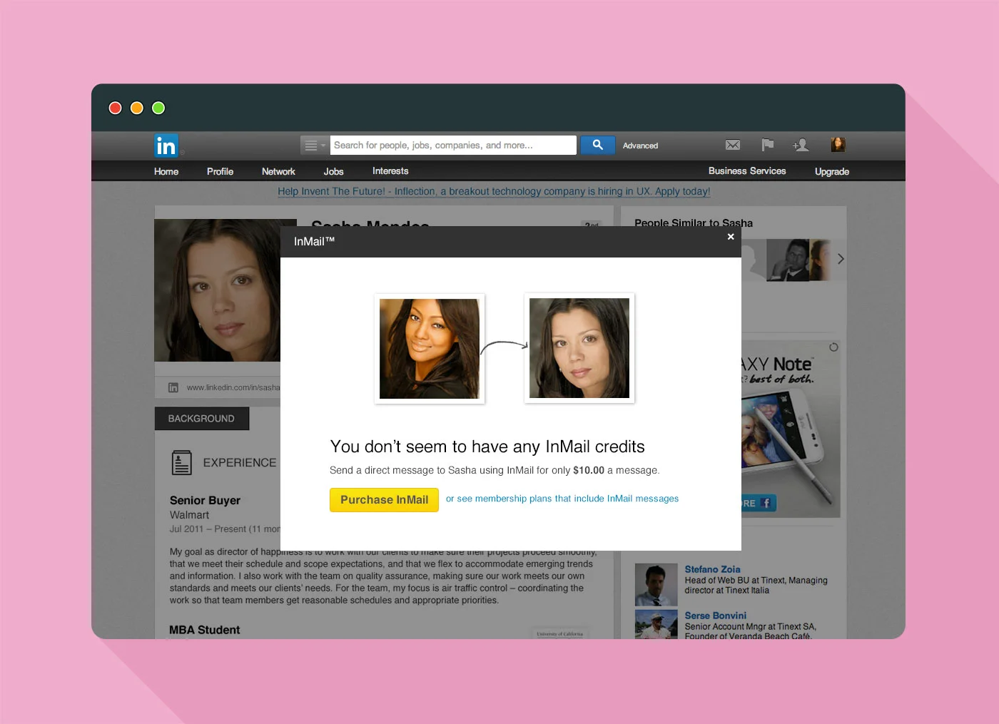
The redesigned default experience when a user clicks on 'upgrade to Premium'
My role
I was the designer on the project. I worked on the wireframes, supported the research, created the high fidelity visuals, and produced production assets.
About the project
LinkedIn wanted to decrease refunds for the experience where people choose a Premium Subscription plan. So, to do this, we wanted to decrease confusion and increase education of the value of a Premium Subscription.
After two rounds of user research, we learned that enabling people to choose the right plan for them based on what they wanted to accomplish and helping them understand the value of a subscription by showing them how they can use these features in a workflow was the best approach. The project was a success decreasing refunds by ~70%.
the old experience
The current purchasing page at the time
LinkedIn has one of the most complicated Premium business models in the industry. It has 4 different families of Premium packages (Professional, Job Seeker, Recruiter, Sales) with multiple subscriptions for each family, making it a total of 15 types of subscriptions available to our members.
An illustration of the 4 families of subscriptions and the amount of plans under each family
The current experience had been optimized to it’s full potential, and there were some drawbacks to it that we wanted to fix in order to decrease refunds and other problems we were having. We thought we could really improve the experience and meet the business goals by helping people choose the right plan for them and understand the value of a subscription. Doing this would decrease confusion and increase satisfaction with the subscription, thus lowering refunds and improving the experience.
USER RESEARCH
To understand how we could help people choose the right plan and understand the value of a subscription, we decided to have 2 rounds of user research. In each round, we gathered 12 participants in Mountain View and San Francisco, and the user researcher interviewed the participants for 2 hours each. Here, I’ll go over how we tested different subscription models in round 1 of research and our key findings.
Round 1 - Choosing the right plan
Many people have a concept of what’s the right model LinkedIn should go with based on their previous experience upgrading on other services. However, we wanted to put this to the test and figure out what works the best for LinkedIn. To do this, we identified across the industry, there were 6 different ways of upgrading users. We created the LinkedIn equivalent for these 6 different methods and showed them to our research participants, and this was the feedback that we got.
Method 1 - One family, one plan
Mock used to test Method 1 - One family, one plan
Similar to the Hulu / Amazon prime model, this experience shows the family and plan we thought would be best for them based on their current behavior on LinkedIn.
Pro: If we got the family and plan right, this worked out really well.
Con: If we chose the wrong family and plan, people didn’t see the value in the subscription. Where this becomes a problem is that many times our algorithms thought that the sales people wanted the Sales subscriptions and Recruiters wanted the recruiter subscription, when really these people may be looking at a LinkedIn Premium subscription for their own personal purposes of getting a job.
Method 2 - One family, all plans
Mock used to test Method 2 - One family, all plans
Like the New York Times subscription model, this experience shows a family we thought would be best for the participant and lets him / her choose the right plan for them under this family.
Pro: If we got the family right, this worked out pretty well. People also liked the idea of choosing the right plan for them because it gave them more control.
Con: Similar to method 1, if we got the family wrong, people didn’t see the value in the subscription.
Method 3 - All family, all plans
Mock used to test Method 3 - All families, all plans
Here, we show all the families we had to offer and all the plans in each one.
Pro: People were able to choose the right family and plan for them and had a better understanding that the plan they choose would help them towards their goals on LinkedIn. They also felt more comfortable with their decision since they could see all the options available to them.
Con: Business wise, it would mean more clicks in the experience for the user.
Method 4 - Guided experience
Mock used to test Method 4 - Guided experience
Here, we ask people questions to help them pick the right family and plan for them, then we showed them one family and one plan at the end of the experience.
Pro: People liked the questions and choosing family based on value proposition.
Con: People didn’t like that we picked a family and plan for them. They wanted more control and wanted to see what their other options were.
Method 5 - Build your own experience
Mock used to test Method 5 - Build your own experience
Here, people can build their own experience similar to how people typically buy cars online. They can add features, like Who’s Viewed Your Profile, and different quantities of InMail.
Pro: This would be good for an existing subscriber who already know how they use LinkedIn Premium.
Con: For a new subscriber, this was overwhelming because if you’ve never used things like InMail before, it’s hard to know how many you’ll need.
Method 6 - Microtransaction
Mock used to test Method 6 - Microtransaction
Similar to the purchasing model in games like Simpsons Tap Out, people can purchase features as they go. Like, InMail credits as you need them.
Pro: It’s non-committal, so you don’t need to subscribe to a plan, so you can try Premium features out and use only the ones you want before committing to a monthly / annual subscription plan.
Con: It’s bad for the business, since we get more life-time-value per user if they subscribe to a plan vs paying à la carte.
End result
We decided that method 3 - all families, all plans worked the best for people figuring out which LinkedIn Premium subscription was right for them.
We also found that using conversational tone whenever possible in the copy, personalization like a person’s name and picture, and colors to help create a friendly experience were all things that users wanted to feel good about choosing a plan. Unlike other services, it’s not a guarantee that purchasing a LinkedIn Job Seeker subscription will mean that a person can get a job, so they put a lot of trust in LinkedIn that we’ll deliver value, so making people feel that we care about them and we’re trying to help them make the best decision possible works for this experience.
The redesigned experience when a user clicks a family

